

If you have ever used image editor applications like Adobe Photoshop, then you might be familiar with Blending. It is one of the most frequently used effects which you can find in most of the websites and other graphics and designs in one form or the other.
Using this feature, you can merge text with images or some other background, or blend images and textures to produce beautiful effects. Wouldn't it be cool if you could create such beautiful effects with just one line of code?
Blending Modes in CSS
You can add these blending effects with two CSS properties which are background-blend-mode and mix-blend-mode. The background-blend-mode is used when you want to blend the background layers (background images or background colors) of an element, whereas mix-blend-mode property is used when you want to blend the content of an element with that of another element (which may or may not be its parent).
Before moving into the main article, let's see what actually happens in blending.
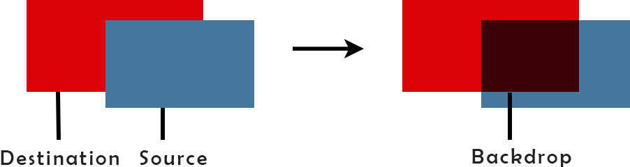
This is an example of color blending, where the colors of the two elements (red and blue blocks) are blended in the region of overlap. The element which lies behind is the destination and the element which overlaps the destination is the source. The region in which the elements overlap and blending takes place is called the backdrop.
Now let's go through both of these blending properties.
mix-blend-mode
The mix-blend-mode property defines the way an element's content blends with that of another element. The content of an element may include anything from text, background images to background colors.
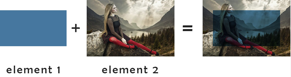
This is how it works. Here, element 2 (having some background image) is the parent of element 1 (having some background color). The two elements overlap which results in the blending of the background color of element 1 with the background image of element 2.
The code for such a blending effect will go as follows.
HTML
<div class="outer_div">
	<div class="inner_div">
		<p>MULTIPLY</p>
	</div>
</div>
CSS
.outer_div{
	background-image:url('image.jpg');
	background-size:cover;
	background-position:center center;
	width:350px;
	height:200px;
	display:table-cell;
	vertical-align:middle;
	text-align:center;
}
.inner_div{
	background-color:#46779F;
	color:white;
	font-size:26px;
	display:inline-block;
	height:70%;
	width:70%;
	margin:auto;
	text-align:center;
	display:table;
	mix-blend-mode:multiply;
}
.inner_div p{
	display:table-cell;
	vertical-align:middle;
}
In this code, the div with class inner_div having a background color blends with the div with class outer_div having a background image.
The property mix-blend-mode is given a value multiply which results in the following effect. There are a number of values for this property which are also stated below.
MULTIPLY
Notice that in the above image, both the contents (text and background color) of the inner div blends the content (background image) of the outer div. Now have a look at all the values for the mix-blend-mode property.
normal : This mode applies no blending.
multiply : The multiply mode multiplies the colors of the source and the destination to get the final color. The image produced is darkened because the final color is at least as dark as either the source color or the destination color.
If we multiply any color with black (with mathematical rgba value '0'), it results in black color (x * 0 = 0).
If we multiply any color with white (with mathematical rgba value '1'), it results in no change in the color (x * 1 = x).
screen : This will multiply the complements of the source and the destination colors and then return the complement of the product. The resultant image is lightened because the final color is at least as light as either the source color or the destination color.
If we screen any color with white, it results in white color.
If we screen any color with black, it results in no change in the color.
overlay : This mode either screens or multiplies the colors depending on the value of the destination color. It applies the screen mode to the colors which are lighter and multiply mode to the colors which are darker. This means that the portion of the top layer where the base layer is light becomes lighter and the portion where the base layer is dark becomes darker.
darken : This mode produces the colors which are darker among the source and the destination colors.
lighten : This mode produces the colors which are lighter among the source and the destination colors.
color-dodge : The color-dodge mode lightens the destination color so that the source content gets reflected by decreasing contrast.
color-burn : This mode darkens the destination color so that the source content gets reflected by increasing contrast.
hard-light : This mode applies effect just opposite of overlay mode. It either screens or multiplies the colors depending on the value of the source color. It applies the multiply mode to the colors which are lighter and screen mode to the colors which are darker.
soft-light : The blending effect of this mode is the same as that of hard-light, with the difference that it darkens or lightens the colors instead of multiplying or screening.
difference : This subtracts the darker of the two colors from the lighter color.
exclusion : This is similar to difference, but produces less contrast.
hue : This creates a color with the hue of the source color and the saturation and luminosity of the destination color.
saturation : This creates a color with the saturation of the source color and the hue and luminosity of the destination color.
luminosity : This creates a color with the luminosity of the source color and the hue and saturation of the destination color.
color : This creates a color with the hue and saturation of the source color and the luminosity of the destination color. This is just the opposite of luminosity.
inherit : The element will inherit the blend mode from its parent.
unset : This removes the blend mode which an element currently has.
The effects that these blending modes produce are shown in the following demo.
MULTIPLY
SCREEN
OVERLAY
DARKEN
LIGHTEN
COLOR-DODGE
COLOR-BURN
HARD-LIGHT
SOFT-LIGHT
DIFFERENCE
EXCLUSION
HUE
SATURATION
LUMINOSITY
COLOR
NORMAL
background-blend-mode
The background-blend-mode property is used to blend the background layers of a single element. These background layers may be background images or background colors.
Blending the background layers of an element in this mode is not affected by the content of any element which is below or on top of it or overlaps it in any way. It works in the same way as mix-blend-mode, the difference here being that the blending is of the different background layers of a single element.
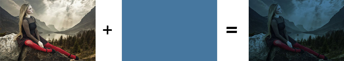
You have seen that in the mix-blend-mode, you have the content of the one element (source) on top of the other element (destination). Similarly in background-blend-mode, if we have a background image and a background color of an element, then the blending takes place considering the background image on the top of the background color.
The code for the above background-blend-mode:multiply blend value is given below.
HTML
<div class="outer_div">
	MULTIPLY
</div>
CSS
.outer_div{
	background-image:url('image.jpg');
	background-color:#46779F;
	background-size:cover;
	background-position:center center;
	width:350px;
	height:200px;
	line-height:200px;
	vertical-align:center;
	text-align:center;
	color:white;
	font-size:26px;
	background-blend-mode:multiply;
}
The effects produced from different values of the background-blend-mode property are shown below. Compare the effects with those produced by the mix-blend-modeproperty.
Notice that in this case, blending has no effect on the text. This shows that in the case of background-blend-mode, only the background layers are blended without affecting its content.
Conclusion
This was a quick introduction to different blending methods that can give your images and web elements a new beautiful look. With these blend modes, you can give nice visual effects to your elements without requiring any professionalism or having to rely on photo editor applications.
Not all browsers currently support CSS blending modes fully. It has good support from Chrome and Firefox, but at the same time IE, Opera and Android doesn't support it. Safari doesn't support hue, saturation and luminosity and colorcurrently.


