

The position property determines the method of positioning of an element. An element can be positioned relative to another element, viewport, or even its own default position in a normal page flow.
CSS
position: value;
Normally, an element is positioned statically on a page. A static position is the one in which the element is placed in a normal page flow. This is the default behaviour. For example, if you write a code to display a heading h2 after a heading h1, then h2 will get displayed just below h1 in a normal page flow. These would be the static positions of the two headings.
However, an element can be positioned relative to the viewport, any other element or its own static position by giving respective values to the positionproperty. Such an element whose position has been changed from static to another value is called a positioned element. These values are discussed below in detail.
The top, right, bottom and left properties can be used with the position property to place the positioned element at the desired location.
Values
The values static, relative, absolute, fixed and sticky that this property can take are explained in separate subheadings. Apart from this, it can take two other universal values which are listed below.
initial : Sets the default value.
inherit : Inherits the value from parent element.
static
This is the default value, which means that every element has a static position by default. An element with a static position is said to be not positioned, and has no effect of the offset values top, right, bottom and left.
In the following demo, the parent div element has three child elements - two div elements and a paragraph. The two blocks with ids block1 and block2 are given blue and green background respectively. Both are given position: static which is also the default value.
HTML
<div id="parent">
  <div id="block1"></div>
  <div id="block2"></div>
  <p>...</p>
</div>
CSS
#block1 {
  width: 100px;
  height: 100px;
  background-color: blue;
  position: static;
}

#block2 {
  width: 100px;
  height: 100px;
  background-color: green;
  position: static;
}
See the Pen position: static by Aakhya Singh (@aakhya) on CodePen.
relative
The element is placed relative to its normal position. In this case, the values of top, right, bottom and left have effect on the element, shifting it from its default position. For example, left: 10px will shift the element 10px towards right from its default position.
The original position of a relatively positioned element remains in the page flow as if the element is still there, even if the element is shifted. The new shifted position does not affect the page flow and can overlap with any other element.
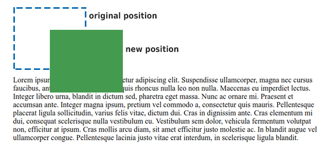
The green block with id block2 in the demo is given position: relative. It is shifted 40px below and 70px towards right from its original position using the top and left properties respectively.
HTML
<div id="parent">
  <div id="block1"></div>
  <div id="block2"></div>
  <p>...</p>
</div>
CSS
#block1 {
  width: 100px;
  height: 100px;
  background-color: blue;
}

#block2 {
  width: 100px;
  height: 100px;
  background-color: green;
  position: relative;
  top: 40px;
  left: 70px;
}
See the Pen position: relative by Aakhya Singh (@aakhya) on CodePen.
In the above example, note that the original position of the shifted element is preserved (which can be seen by the gap between the blue box and the paragraph) and its new position is not affecting the nomal flow of the page.
absolute
The element is placed relative to its first positioned ancestor, i.e., the closest ancestor whose position value is not static. If there is no such ancestor, then it is positioned relative to the viewport (visible area of a webpage). In this case also, the top, right, bottom and left properties work for the element. For example, left: 10px will shift the element 10px right from the left edge of its nearest positioned parent container.
For an absolutely positioned element, its original position no longer remains in the page flow and the new shifted position can overlap with any other element.
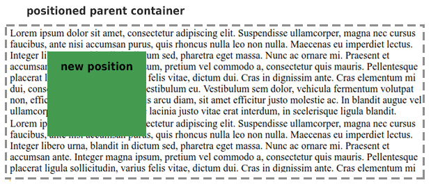
In the following demo, the parent div container is given position: relativebecause we want to position the green block with respect to it. The green block with id block2 is given position: absolute and is shifted 40px below and 70px towards right from its relatively positioned parent's top left corner using the top and left properties respectively.
HTML
<div id="parent">
  <div id="block1"></div>
  <div id="block2"></div>
  <p>...</p>
</div>
CSS
#parent {
  position: relative;
  border: dashed;
}

#block1 {
  width: 100px;
  height: 100px;
  background-color: blue;
}

#block2 {
  width: 100px;
  height: 100px;
  background-color: green;
  position: absolute;
  top: 40px;
  left: 70px;
}
See the Pen position: absolute; by Aakhya Singh (@aakhya) on CodePen.
Note that the original position of the shifted element is not preserved (because there is no gap between the blue box and the paragraph) and its new position overlaps with the paragraph content and does not affect the nomal flow of the page.
fixed
The element is placed relative to the viewport, and thus its position on the screen does not change on scrolling. Its position is also set using the top, right, bottom and left properties. For example, left: 10px will place the element 10px right from the left edge of its viewport.
For a fixed element, its original position no longer remains in the page flow and the new shifted position can overlap with any other element.
In the following demo, the green block with id block2 is given position: fixed and is shifted 40px below and 70px towards right from the viewport's top left corner using the top and left properties respectively.
HTML
<div id="parent">
  <div id="block1"></div>
  <div id="block2"></div>
  <p>...</p>
</div>
CSS
#block1 {
  width: 100px;
  height: 100px;
  background-color: blue;
}

#block2 {
  width: 100px;
  height: 100px;
  background-color: green;
  position: fixed;
  top: 40px;
  left: 70px;
}
See the Pen position: fixed by Aakhya Singh (@aakhya) on CodePen.
Scroll the content in the above example nad observe the position of the green box. Here, the green box does not affect the page flow and overlaps with other content.
sticky
A sticky element behaves as both relative and fixed elements, depending on the scroll position. It behaves as a relatively positioned element until a given offset position is reached on scrolling, and after that it behaves like a fixed element. This offset position is set by the offset properties like top, right, bottom and left.
So, a sticky element scrolls with the rest of the content (and acts as a relatively positioned element) until a give offset position is reached and then it sticks at that place (and acts as a fixed element).
In the following demo, the green block with id block2 is given position: sticky and top: 40px, which makes 40px as the threshold value. So, the green box will scroll with the rest of the content till it reaches 40px below the top of the viewport, and after that acts like a fixed element and gets stuck at that position.
HTML
<div id="parent">
  <div id="block1"></div>
  <div id="block2"></div>
  <p>...</p>
</div>
CSS
#block1 {
  width: 100px;
  height: 100px;
  background-color: blue;
}

#block2 {
  width: 100px;
  height: 100px;
  background-color: green;
  position: sticky;
  top: 40px;
}
See the Pen position: sticky by Aakhya Singh (@aakhya) on CodePen.
More examples
After having understood the different ways in which you can position your website elements, have a quick look at some more examples.
The following demo shows how giving left: 30px added 30px to the left and left: -30px subtracted 30px from the left edge of the original position of relatively positioned headings.
See the Pen relatively positioned headings by Aakhya Singh (@aakhya) on CodePen.
The following demo is just the same as shown in the explanation of the position value absolute, with the difference that the parent container is itself shifted 70px left. This is make it clear that the absolutely positioned green box is always placed relative to its parent container, no matter the parent container is itself placed.
See the Pen position: absolute example by Aakhya Singh (@aakhya) on CodePen.
Look at another example of fixed element.
See the Pen position: fixed example by Aakhya Singh (@aakhya) on CodePen.
Browser Support
This property is supported in all modern browsers. The value sticky is not supported in IE and Edge 15 and earlier versions.


