

Many of you must have faced a problem regarding different sizes of the fonts while giving multiple fonts to the font-family property, because different fonts appear in different sizes for the same font-size value. CSS provides the font-size-adjust poperty to tackle this problem.
The font-size-adjust property allows you to have a better control of the font size when the first font choice is not available.
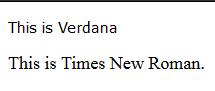
Different fonts have different aspect ratios i.e. the difference between the size of the lowercase letter 'x' and the uppercase letter 'X' of that font. Normally, we give more than one font to the font-family property so that the browser uses the second font if the first font is unavailable and the sizes of both the fonts may appear significantly different even on giving the same font size. For example, see the difference between the sizes of the fonts Verdana and Times New Roman on giving a font size of 15px to both.
See the Pen demo by Aakhya Singh (@aakhya) on CodePen.
This difference is due to different aspect ratios of the two fonts. Suppose we give two fonts to the font-family property, the first one being Verdana and the second one Times New Roman. Now we want that both the fonts should appear equal in size so that there is no significant change in the size of the font if the first font doesn't load.
This can be achieved by making the aspect ratio of both the fonts equal using the font-size-adjust property. It is good to make the aspect ratio of the second font equal to that of the first because it is the first font which is our first preference.
The aspect ratio of Verdana is 0.55 whereas that of Times New Roman is 0.45. In the following example, the aspect ratio of Times New Roman is made equal to that of Verdana.
See the Pen Giving font-size-adjust by Aakhya Singh (@aakhya) on CodePen.
Notice the change in the size of the text having the font Times New Roman on changing its aspect ratio. The above result may not be seen in many browsers since this property is supported by just a few browsers which include Firefox.
For others, the result is shown in the following image.
So, now you can simply give fallback fonts as shown below without much worrying about the difference in font size if the first font doesn't load.
CSS
.element {
	font-family: Verdana, "Times New Roman", sans-serif;
	font-size: 15px;
	font-size-adjust: 0.55;
}
In the above case, the height of the lowercase letters of the two fonts would 8.25px as 0.55 * 15 = 8.25.


Aspect ratios for some common fonts are given in the following table.
| Font | Aspect Ratio |
| Arial | 0.52 |
| Avant Garde | 0.45 |
| Bookman | 0.40 |
| Calibri | 0.47 |
| Cambria | 0.47 |
| Cochin | 0.41 |
| Comic Sans | 0.53 |
| Courier | 0.43 |
| Courier New | 0.42 |
| Garamond | 0.38 |
| Georgia | 0.48 |
| Helvetica | 0.52 |
| Palatino | 0.42 |
| Tahoma | 0.55 |
| Times New Roman | 0.45 |
| Verdana | 0.55 |
Browser Support
This property is not supported by majority browsers. A few ones supporting it include Firefox.
Conclusion
This is a great hack to prevent significant decrease in the font size in case your first font choice doesn't load. Though it has a big limitation of being supported by just a few browsers. In this case, you can choose fonts of almost the same aspect ratio to prevent size difference.


