

The border-radius property defines the shape of the corners of the borders of an element. It is used to round the shape of the corner. It is a shorthand property that sets the values of the properties - border-top-left-radius, border-top-right-radius, border-bottom-right-radius and border-bottom-right-radius in a single declaration.
The values given to this property define the radii of a quarter ellipse that defines the shape of the outer edge of the border of each corner. This is explained in detail below.
Syntax 1
border-radius: [horizontal radius] / [vertical radius];
The value before the slash ('/') sign is the horizontal radius while the value after that is the vertical radius. If any one of the two radii is 0, then the corner is square, and not rounded.
If the two radii values are not equal, then it results in an elliptical curve. If those are equal, then it results in a circular curve.
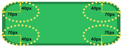
Look at the following example in which the each corner of the div is an elliptical curve because the horizontal and vertical radii of each curve are 70px and 40px respectively.
CSS
border-radius: 70px/40px;
See the Pen border-radius example by Aakhya Singh (@aakhya) on CodePen.
Syntax 2
border-radius: [radius];
When only one value is specified, then both the horizontal and the vertical radii become equal to that value, resulting in a circular curve.
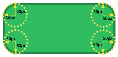
The following example will make each corner of the div of the shape of the edge of a quarter circle of radius 50px.
CSS
border-radius: 50px;
See the Pen border-radius example by Aakhya Singh (@aakhya) on CodePen.
Values
<length> : Specifies the radius using fixed length in px, em, etc. Negative values are not allowed
<percentage> : Specifies the radius in percentage. Percentage for the horizontal radius refers to the width of the border box and that for the vertical radius refers to the height of the border box. Negative values are not allowed.
initial : Sets the default value.
inherit : Sets the same value as that of the parent element.
Giving multiple values
You can give upto four values to the border-radius property for giving different radii to different corners of a box element.
Giving four values
The first, second, third and forth values define the top-left, top-right, bottom-right and bottom-left border radius respectively.
CSS
border-radius: 10px 20px 30px 40px;
For the above declaration
- top-left border radius is 10px
- top-right border radius is 20px
- bottom-right border radius is 30px
- bottom-left border radius is 40px
Giving three values
The first and the third values define border radii for the top-left and the bottom-right corners respectively. The second value defines the top-right and the bottom-left border radii.
CSS
border-radius: 20px 40px 70px;
For the above declaration
- top-left border radius is 20px
- top-right and bottom-left border radii are 40px
- bottom-right border radius is 70px
Giving two values
The first value defines the border radii of the top-left and the bottom-right corners. The second value defines the border radii of the top-right and the bottom-left corners.
CSS
border-radius: 40px 70px;
For the above declaration
- top-left and bottom-right border radii are 40px
- top-right and bottom-left border radii are 70px
Giving one value
It defines the border radii of all the four corners.
CSS
border-radius: 50px;
For the above declaration
- border radii of all the four corners are 50px
The effect of all the above listed four cases is shown in the following demo.
See the Pen border-radius examples by Aakhya Singh (@aakhya) on CodePen.
This was the case when no slash ('/') is used in the declaration i.e. when each corner is of the shape of a quarter circular arc.
If a slash is used, then you can give upto eight values to the declaration - four before the slash sign and four after it.
The values specified before slash and those specified after the slash are applied in the same order as mentioned above. Look at the following example.
CSS
border-radius: 10px 20px 30px 40px / 25px 31px;
This declaration is equivalent to the one shown below.
CSS
border-top-left-radius: 10px 25px;
border-top-right-radius: 20px 31px;
border-bottom-right-radius: 30px 25px;
border-bottom-left-radius: 40px 31px;
Examples
The element's background and corner will be rounded even if you don't explicitly define its border using the border property.
You can use percentage values to create a complete circular shape. Giving border-radius: 50% to an element whose width is equal to its height yields a circular shape of the element, otherwise it yields an ellipsoidal shape. In the following example, the first div has equal width and height values whereas the second div has different.
See the Pen border-radius: 50% by Aakhya Singh (@aakhya) on CodePen.
On rounding corners, the content of the element may overflow at the corners which are rounded.
See the Pen border-radius overflow by Aakhya Singh (@aakhya) on CodePen.
To prevent this, you can add some padding that is sufficient to prevent the overflow of the content as shown below.
See the Pen border-radius example by Aakhya Singh (@aakhya) on CodePen.
If an element has a background (background color or background image), then the background will also be clipped to the specified border radius. In the above examples, you have seen the background color getting rounded at the rounded corners. The following example shows the background image getting rounded at the rounded corner of the element.
See the Pen border-radius example by Aakhya Singh (@aakhya) on CodePen.
If an element has a border image, then the image is not clipped to the rounded border radius.
Browser Support
This property is supported in all the major browsers. For maximum browser compatibility, use the prefixes -webkit- and -moz-.


