

The height property specifies the height of an element. By default, it specifies the height of an element's content area. So, addition of padding, border or margin will increase the total visible height.
CSS
height: value;
Before proceeding, you must have a brief idea about the CSS Box Model.
CSS Box Model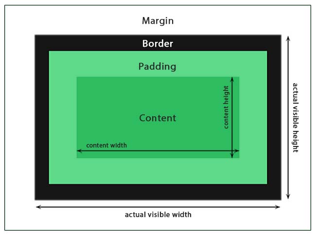
The box model of an element contains four boxes - content box, padding box, border box and margin box.
The content box contains all the content like text, images, tables of the element. Padding is the area around the content of the element that separates it from the border. The border area surrounds the padding area and contains the borders. Lastly, the margin area is an empty area that surrounds the border area. It is used to separate the element from other elements which are its neighbours.
So what comprises of the width and the height of the element?
The properties width and height determine the width and height of the content area. On giving padding and borders, the visible or rendered width and height increase. This is shown by the following equations.
width + padding + border = actual visible width
height + padding + border = actual visible height
Using box-sizing property
This property controls whether the width and height values include padding or border. It can take the following three values
content-box : The height property specifies the height of only the content box. This is also the default value.
padding-box : The height property specifies the height of the padding box, which includes content and padding.
border-box : The height property specifies the height of the border box, which includes content, padding and border.
Values
auto : The browser calculates the height depending on other properties. This is the default value.
<length> : Specifies the height in px, pt, em, rem, etc.
<percentage> : Specifies the height as a percentage of the height of the containing block.
initial : Sets the default value.
inherit : Inherits value from parent element.
Examples
Look at the following demo in which the height of a paragraph is set as 200px. Since no width value is specified, so the paragraph occupies all the horizontal space available to it. Its height will remain 200px even if its content overflows.
HTML
<p>Lorem ipsum ... ligula laoreet.</p>
CSS
p {
  border: solid 2px;
  height: 200px;
}
See the Pen CSS height property example by Aakhya Singh (@aakhya) on CodePen.
The second demo shows three cases. Each of the three paragraphs is given a height of 150px and a 2px border, and each contains an image.
In the first paragraph, the image is given width as 200 and height as 124 using the width and the height attribute respectively in HTML.
In the second paragraph, the image is not given any HTML attribute and its height is set as 50% using the height property. This made the height of the image 50% of its parent element p, and its width got resized accordingly to maintain the aspect ratio (ratio of width to height) because the default value of width is auto.
In the third paragraph also, the dimensions of the image is set using the widthand height attributes. The image is also given height: 50%. The height assigned to the image using the height property overrode the height assigned to it using the height attribute, thus making the height of the image 50% of its parent element. Since no width property is defined, the image takes the width defined by the width attribute.
HTML
<p><img src="logo.jpg" width="200" height="124"></p>

<p><img id="img2" src="logo.jpg"></p>

<p><img id="img3" src="logo.jpg" width="200" height="124"></p>
CSS
p {
  border: solid 2px;
  height: 150px;
}

#img2 {
  height: 50%;
}

#img3 {
  height: 50%;
}
See the Pen Giving height in percentage to images by Aakhya Singh (@aakhya) on CodePen.
Note that the height of an element expressed in percentage will change on changing the container height. The width of the image in the third case in the above demo can be made to resize according to its height by setting the widthproperty to auto for the image.
HTML
<p><img src="logo.jpg" width="200" height="124"></p>
CSS
p {
  border: solid 2px;
  width: 250px;
}

img{
  height: 50%;
  width: auto;
}
See the Pen width and height example by Aakhya Singh (@aakhya) on CodePen.
In this case, there is no effect of width and height attributes on the image dimensions.
Browser Support
This property is supported in all modern browsers.


