

The border-image-slice property is used to specify how to divide a border image into different regions. Its shorthand property is border-image.
CSS
border-image-slice: value;
This property slices the border image into nine regions - four corners, four edges and one middle region. The size of these regions is decided by the top, right, bottom and left offsets made by the four lines shown in green in the following figure.
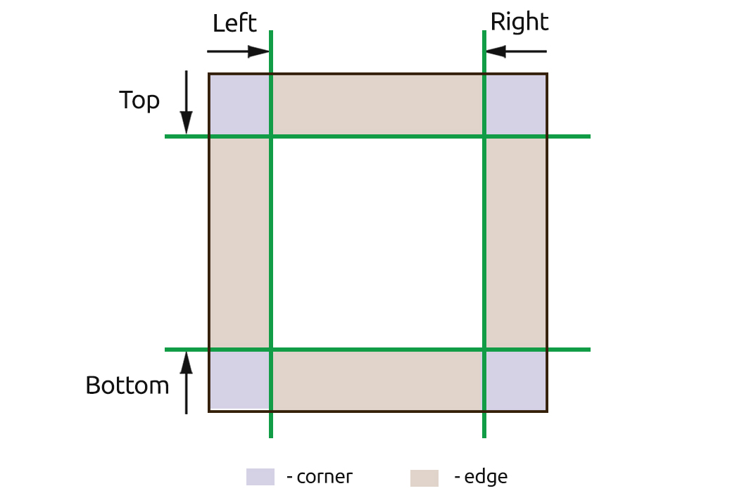
These offsets are created using the border-image-slice property.
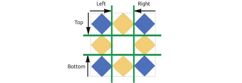
Take an example of an image shown below and see how it is divided into the nine regions.
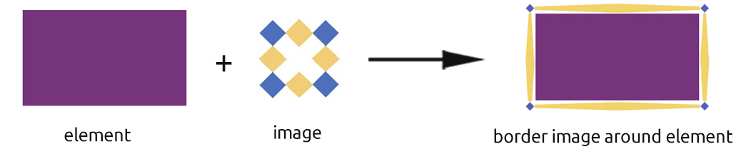
When this image is set as the border image of an element, its corners cover the element's corners, its edges cover the element's edges and the middle region covers the inside of the element. The middle region is transparent (except when the value is set to fill) so that the inside of the element is visible through it.
See the Pen CSS border-image-slice by Aakhya Singh (@aakhya) on CodePen.
Values
<number> : Specifies offset of edge in the form of pixels for raster images and coordinates for vector images (SVG). It is not given any unit.
<percentage> : Specifies offset of edge as a percentage of the width (for right and left offsets) or the height (for top and bottom offsets) of the image. The default value is 100%.
fill : Displays the middle region of the border image as a background above the actual background of the element.
initial : Sets the default value.
inherit : Inherits the value from parent element.
Example
Have a look at the effect of different border-image-slice values on the edge offsets of a border image.
HTML
<div id="div1">border-image-slice: 10%</div>
CSS
div {
  width: 400px;
  padding: 10px;
  border: solid 20px;
  border-image-source: url('/path/image.jpg');
  border-image-width: 20px;
  border-image-repeat: round;
}

#div1 {
  border-image-slice: 10%;
}
See the Pen CSS border-image-slice by Aakhya Singh (@aakhya) on CodePen.
The other three properties border-image-source, border-image-width and border-image-repeat are used to set the border image, the width of the border image and the repetition behaviour of the border image respectively.
Note: The border-style property must be defined before the border-image-source property to set a border image.
Giving different values for different border sides
You can give four or less than four values to the border-image-slice property. The effect of each of these on border image slicing is given below.
Giving four values
The first, second, third and fourth values define the top, right, bottom and left offset respectively.
CSS
border-image-slice: 40% 70% 50% 20%;
For the above declaration
- top offset is 40%
- right offset is 70%
- bottom offset is 50%
- left offset is 20%
Giving three values
The first value defines the top offset and the third value defines the bottom offset. The second value defines the right and left offsets.
CSS
border-image-slice: 40% 70% 20%;
For the above declaration
- top offset is 40%
- right and left offsets are 70%
- bottom offset is 20%
Giving two values
The first value defines the top and bottom offsets. The second value defines the right and left offsets.
CSS
border-image-slice: 40% 70%;
For the above declaration
- top and bottom offsets are 40%
- right and left offsets are 70%
Giving one value
It defines all the four offsets.
CSS
border-image-slice: 40%;
- all the four offsets are 40%
Check out another demo.
See the Pen CSS border-image-slice by Aakhya Singh (@aakhya) on CodePen.
Browser Support
This property is not supported in IE 10 and its earlier versions.


