

The border-image property allows you to set an image as the border of an element. It is a shorthand property for five border image properties - border-image-source, border-image-slice, border-image-width, border-image-outset and border-image-repeat.
CSS
border-image: [border-image-source] [border-image-slice]/[border-image-width]/[border-image-outset] [border-image-repeat];
There is no specific order in which the values are given in the declaration except the order of border-image-slice, border-image-width and border-image-outset. Also, it is not necessary to give all the values.
See the Pen CSS border-image by Aakhya Singh (@aakhya) on CodePen.
- A border image overrides the border set by the border-style property. However, if the
border-image-sourcevalue isnone, or if the border image fails to load, then the border is set by the border-style property. - The
border-styleproperty must be defined before theborder-image-sourceproperty to set a border image. - By default, a border image takes the width specified by the border-width property. If the
border-image-widthvalue is greater than the width of the border specified by the border-width property, then the border image exceeds the border box of the element and may overlap with its content. - Browser uses default values for the properties whose values are not specified in the shorthand declaration.
How this works
An image is set as the border of an element in a stepwise manner.
1. The url of the image to be set as border is given to the border-image-source property.
2. After this, the border-image-slice property slices the border image into nine regions - four corners, four edges and one middle region. The size of these regions is decided by the top, right, bottom and left offsets made by the four lines shown in green in the following figure.
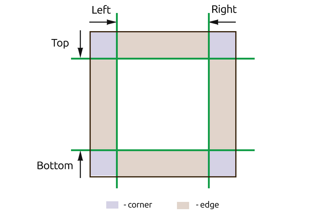
These offsets are created using the border-image-slice property.
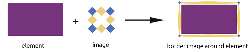
Take an example of an image shown below and see how it is divided into the nine regions.

When this image is set as the border image of an element, its corners cover the element's corners, its edges cover the element's edges and the middle region covers the inside of the element. The middle region is transparent (except when the value is set to fill) so that the inside of the element is visible through it.
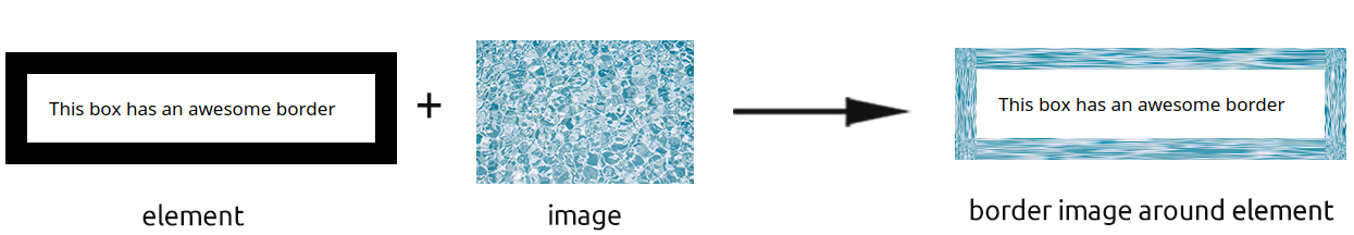
3. Then the image is repeated and rescaled according to the border-image-repeat and border-image-width values.
Values
The possible values which can be given for these longhand properties are given below.
border-image-source
This is used to specify the path of the image which is to be used as the border. Its default value is none.
<image> | none
See the Pen CSS border-image by Aakhya Singh (@aakhya) on CodePen.
border-image-slice
This is used to specify how to divide a border image into different regions. It can take one of the following values. Its default value is 100%.
<number> | <percentage> | fill
See the Pen CSS border-image by Aakhya Singh (@aakhya) on CodePen.
border-image-repeat
This is used to specify how a border image is repeated. It can take one of the following values. Its default value is stretch.
stretch | repeat | round | space
See the Pen CSS border-image by Aakhya Singh (@aakhya) on CodePen.
border-image-width
This is used to specify the width of a border image. It can take one of the following values. Its default value is 1.
<number> | <length> | <percentage> | auto
See the Pen CSS border-image by Aakhya Singh (@aakhya) on CodePen.
border-image-outset
This is used to specify the distance by which a border image moves outside the element's border box. It can take one of the following values. Its default value is 0.
<number> | <length>
See the Pen CSS border-image by Aakhya Singh (@aakhya) on CodePen.
In the above demo, 30% is the border-image-slice value and 20px is the border-image-width value and the values after the second '/' specify the border-image offset values.
Apart from these, the border-image property can also take the following universal values.
initial : Sets the default value of the property.
inherit : Inherits the value from parent element.
Example
See the Pen CSS border-image by Aakhya Singh (@aakhya) on CodePen.
The declaration used in the above demo is equivalent to the following individual declarations.
border-image-source: url('border.jpg');
border-image-slice: 30%;
border-image-width: 20px 5px 30px 15px;
border-image-outset: 0;  /* default value */
border-image-repeat: repeat stretch;
Browser Support
This property is not supported in IE 10 and its earlier versions.


