

The float property is used to place an element either along the left or the right side of its container element, while the rest of the content wrapping around it.
CSS
float: value;
Such an element which is placed either to the left or to the right inside its container using this property is called a floating element. The remaining content of the page wraps around it. An element that has floated to the left is wrapped around its right side by the rest of the content, and an element that has floated to the right is wrapped around its left side.
Before understanding how this property works, have a look at the values it can take.
Values
none : The element does not float. This is the default value.
left : The element floats to the left and the rest of the content surrounds its right side.
right : The element floats to the right and the rest of the content surrounds its left side.
initial : Sets the default value of the property.
inherit : Inherits the value from parent element.
How float works?
As discussed earlier, this property can be used to float an element either to the left or to the right side inside its container, with the rest of the content wrapping it around the other side.
Take an example of a paragraph containing an image and some text. Normally, the image and the text will be displayed in the same line (because both show inline characteristics). However, the image can be floated to the left side of the paragraph on giving it float: left.
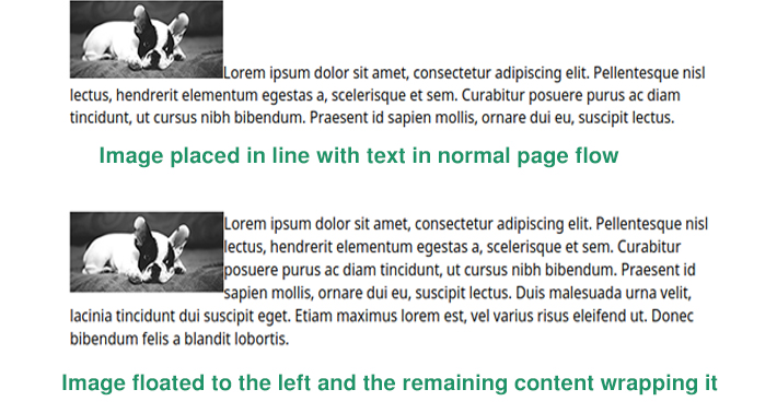
In this way, the image is removed from the normal flow of the page (though is still a part of the flow). This example is demonstrated below.
HTML
<p>
  <img src="dog.jpg">
  Lorem ipsum dolor sit .... at risus
</p>
CSS
p {
  border: solid;
}

img {
  float: left;
}
See the Pen float: left example by Aakhya Singh (@aakhya) on CodePen.
Look at another example in which one image is floated left and another floated right.
See the Pen float: left and float: right example by Aakhya Singh (@aakhya) on CodePen.
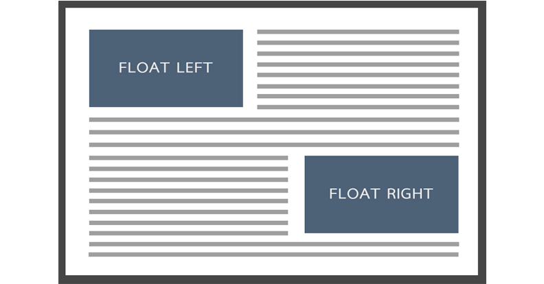
Floating block-level elements
Using the float property, block-level elements can be placed in the same horizontal line next to each other, i.e., made to float next to each other. (A block-level element takes the entire horizontal space by default, even if its width is specified)
In the following demo, seven div elements (which are block-level elements) are placed next to each other by giving them some width and height and float: left. The first div touches the left edge of the container. The second div is placed to the right of the first, and similarly all the others are placed. When the first line of the containing box gets filled, the remaining blocks wrap to the next line.
HTML
<div>float left</div> <div>float left</div> <div>float left</div> <div>float left</div> <div>float left</div> <div>float left</div> <div>float left</div>
CSS
div {
  width: 100px;
  height: 100px;
  margin-right: 20px;
  margin-bottom: 20px;
  background-color: #4c6078;
  text-align: center;
  color: white;
  float: left;
}
See the Pen floating block-level elements by Aakhya Singh (@aakhya) on CodePen.
Look at another example below which shows a combination of left floated, right floated and no floated blocks.
See the Pen floating block-level elements by Aakhya Singh (@aakhya) on CodePen.
Collapsing of container height
A floating element does not contribute to the height of its container. So, the height of the container will only depend on the height of the remaining content as shown in the following figure.
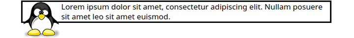 This can create a problem that the floating element can overlap with the element that is below the collapsed container, which is undesirable. In the following figure, the floating element of the first container overlaps with the element just below it.
This is shown in the following demo.
HTML
<div><img src="penguin.png">First container.</div>

<div style="margin-top: 5px;">Paragraph below first container.</div>
CSS
div {
  border: solid;
}

img {
  float: left;
}
See the Pen Height of container of floating element by Aakhya Singh (@aakhya) on CodePen.
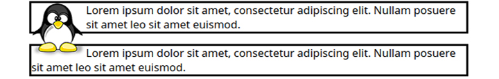
The problem of collapsing containers can be solved by clearing the floats inside the container containing them. This is done after the floating elements and before the end of the container containing them.
Methods used for Clearing Floats
We will be discussing three methods to clear floats to avoid collapsing of containers.
Adding an empty div
Add an empty div before the end of the container and use the clear property to clear all the floats of the container as shown below.
HTML
<div style="clear: both"></div>
On adding this, the height of the parent container expands to contain the floating element entirely within it. Instead of div, other elements like p and brcan also be used.
See the Pen Clearing floats by Aakhya Singh (@aakhya) on CodePen.
Using the overflow property
The overflow property can also be used to expand the parent container's height to contain the floating elements by setting its value to hidden or auto.
Though the overflow property is not solely for clearing floats, it is an effective method for the same. This method is also better than the previous one because it does not involve addition of any new element.
See the Pen Clearing floats using overflow property by Aakhya Singh (@aakhya) on CodePen.
Using the :after pseudo element
This is the most effective method for clearing floats. Just simply add the following CSS code for the parent container, where parent is the id of the parent container. Also check the browser compatibility of individual properties.
CSS
#parent:after {
  content: ".";
  visibility: hidden;
  display: block;
  clear: both;
  height: 0;
}
The pseudo element :after is an element which when applied to an element (parent container in this case), gets added after all its content. This works in the same way as addition of a div in the first method.
In the above code, some content is added using the content property and is hidden using the visibility property. This invisible content is made block-level so that it occupies a whole new line after all the container's content using the display property and made to clear the floats using the clear property. Finally, its height is made 0 so that it doesn't occupy extra space.
See the Pen Clearing floats using CSS by Aakhya Singh (@aakhya) on CodePen.
More Examples
Here are a few more examples of what all you can do using the floatproperty.
You can enlarge and change the styling of the first character(s) of a paragraph or any other element by enclosing it within span and giving it float: left as shown in the following demo.
See the Pen Enlarging first letter in paragraph by Aakhya Singh (@aakhya) on CodePen.
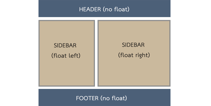
This property can also be used to create web layouts like the one shown in the following figure.
 This can cause an undesirable result if the height of one sidebar is smaller than that of the other, as the one shown below.
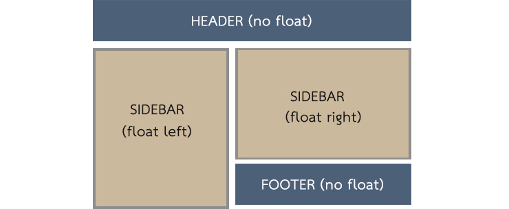
This can be corrected by clearing the footer so that it remains below both the floating columns. Go to the clear property post to learn more about this property.
CSS
#footer {
  clear: both;
}
For a better result, give float: left to the first sidebar and a margin-left value to the other, and clear: left to the footer as shown in the following demo.
See the Pen Designing web page with floats by Aakhya Singh (@aakhya) on CodePen.
To be noted
There are a few points related to floats which you should keep in mind.
- An absolutely positioned element cannot be floated.
- A floating element is removed from the normal flow of the page, but remains in the flow of the page (not removed from the page). It still affects the flow of other elements in the page.
- When an element is floated, its
displayvalue becomesblock, even if it is set to some other value. - If the width of a floating element is less than the available space, then it shifts onto the next line.
- The margins of a floating element doesn't collapse with the margins of the neighbouring elements.
Browser Support
This property is supported in all the major browsers.


